Graphic design is my craft. And I love my craft. I fit together all the pieces of the puzzle you didn’t know existed. I value simplicity, elegant solutions, and finding the optimal method of communicating a message.

With a pragmatic, analytical approach to graphic design, I am an excellent worker bee eager to complete my next task. 10+ years of part-time graphic design experience, seeking to transition to full-time graphic design.

Print - Illustration - Web Design - Logos - Pamphlets - Informational

Branding

Game Developer Picklefeet Games

Picklefeet Games is a young, independent video game developer. Having one successful game under their belt, Picklefeet Games is driven to produce small, successful games that they are proud of and would play themselves.

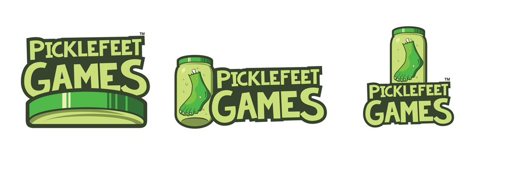
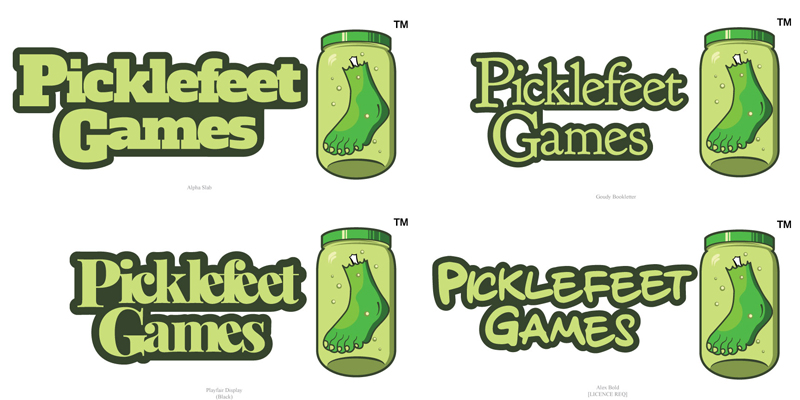
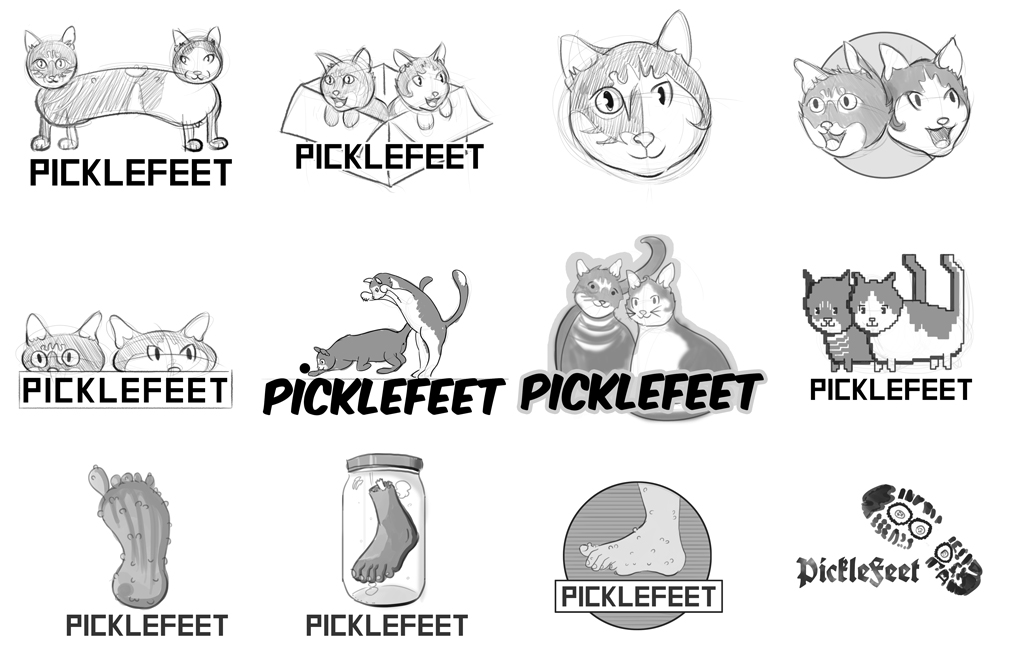
The name is derived as a neologism of the founders cats, Pickle and Tinyfeet. Using this as a starting point I sketched up some ideas featuring depictions of the two. I added some literal interpretations of the name to explore another direction, which they ended up liking. Having settled on the picklefeet jar logo, the challenge then was finding the right typeface to reflect both the gnarly nature of the logo while maintaining a professional, modern look.

Mobile Application

Grocery Shopping App LaissezFare

LaissezFare is a mobile application that tracks pricing information and upcoming sales for local grocery stores and food markets.

I designed the logo and app icon to reflect its purpose: a friendly, unassuming cartoon carrot with a dollar sign for its leaf. The app is approachable and tells users this is going to help them find the best deals on foodstuffs. The user interface is simple and intuitive, utilizing existing design lexicography so that the user knows at first glance how to use the app.

Product Design

Wine Labels Grove Winery

Located in the Haw River Valley, Grove Winery specializes in crafting European-style wines and is one of the most awarded wineries on the East Coast.

For this radical re-branding, I wanted to capture the simple elegance of wine while paying homage to its South-Eastern origins. The simple burgundy colored dot repeated through the labels is reminiscent of a drop of wine while capturing the simple elegance I was hoping to achieve. Coupled with the plain, curved shapes which reflect the bottles and liquid within and bold new logotype, these new labels make a strong statement.

Illustration

Christmas Cards The Travel Connection

Layout Design

Magazine Spread Ocracoke Island

Ocracoke Island, where the infamous pirate Blackbeard made port, is a small island off the coast of North Carolina with good fishing and a thriving music community.

In this multi-page spread, I was tasked with highlighting all that Ocracoke Island has to offer for prospective local tourists. The challenge here was balancing images of the scenic island with a wealth of information on local hot spots, activities, and attractions.

Music Album

Album Art & Promotional Material Florence + Machine

British indie rock band Florence and the Machine’s music is dark, robust and romantic; their style classic and soulful, exuding a casual elegance.

I designed the album art and accompanying promotional material for their new album Tides. I wanted to keep the established visual style from past albums while exhibiting the band’s front-runner Florence Welch’s beauty and elegance. The album’s cover is a simple portrait of Florence, with the band’s logo and album title in a decorative Art Deco typeface which captures the band’s personality. For the promotional material I wanted to capture the indie spirit with a minimalist hand drawn poster and an advertisement in line with the established design aesthetics of the album.

Packaging Design

Tea Boxes AiravaTea

Deriving it’s name from the mythical Hindu “elephant of the clouds” Airavata, the AiravaTea brand was designed to showcase it’s Indian origins along with its light, refreshing, and calming characteristics.

I used the namesake’s white elephant as direct inspiration for the logo, and incorporated henna tattoo elements as subdued decorative flourish for its cultural elements. I kept the rest of the design as uncluttered as possible to reflect its light, calming tone. Note the hourglass shape on the box front, used to subtly suggest the slimming, healthful nature of the tea.

Advertising

Marketing Campaign Ernest Alexander

Earnest Alexander is a boutique clothing and accessories maker in New York City. Their flagship product, the Hudson Wax Messenger bag, built their reputation for stylish and durable manufacturing.

For the marketing campaign, I wanted to focus on their commitment to quality craftsmanship. I achieved this by using images reminiscent of pre-industrial artisans and highlighting the weight and feel of the bag, denoting an item with an antique, almost heirloom quality. To temper this gravitas, I employed humor in the copywriting to keep the company friendly and approachable.

Web Design

Online Florist florella.com

Florella is an online retailer which offers the largest range of artificial and silk flowers and fake plants in the country, priding themselves on their dedication to quality, style, and perfecting the art form of artificial creativity.

I created a simple, elegant and professional website. The colors are warm and inviting, and the clean layout makes user interaction a painless user experience.